ICAP by Digital Assurance & Accounting Board (DAAB), in response to challenges brought by emerging digital technology, introduced an extensive course on Data Analytics in 2021. The course is intended for professionals using data for finance, audit and other business decisions. It is aimed to provide the participants with skillset, to understand and create financial models using software & tools to have better insights for improved decision making in timely and efficient manner. It emphasizes on financial modeling, forecasting, technical software and system language that facilitate prediction of potential results based on patterns.
The three course modules total of 144 hours, are designed in a way that each module is a level higher to the preceding one, exploring tools for data from descriptive to predictive analytics. Each module is followed by two hourly practice session.
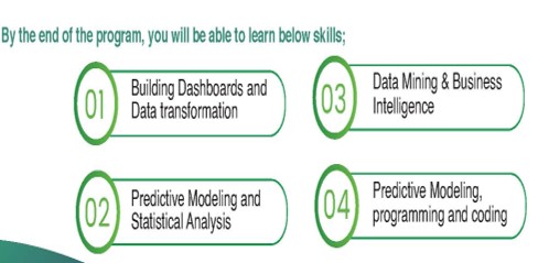
By the end of the program, you will be able to learn below skills;
Who Should Attend:
This course is designed for ICAP affiliates, Chartered Accountants, Executive Management and other Finance Professionals seeking to enhance their competencies in Data Analytics.
Course Content and Learning Outcomes:
Financial modeling helps business leaders in making informed decision based on data analytics. In this course, you will learn how to create financial models for budgeting, forecasting and corporate valuation. The course will also include revenue & expense modelling, assets and liabilities, depreciation, and taxation as well as financing and taxation. Finally, the course will also cover presenting the outcome in the form of dashboards along with the capability to perform what-if analysis.
In this module, we will cover a three-statements financial model using Microsoft Excel. Exercises will be used throughout the module to provide a practical understanding of these key topics. Participants will be able to create an integrated financial model, analyze the impact of using variable input fields, protect the content and layout of the model, share the model with other participants and present the outcome in a visually appealing dashboard.
Learning outcomes:
Describe financial modeling basics
Apply best practices in financial modelling
Design the layout and structure of the model
Review the three financial statements used in financial modeling
Discuss and develop various components of the model - revenue and expenses, assets & depreciation, debt and equity, dividends and taxation etc.
Explore the valuation process in financial models.
Discuss error handling and error proofing of the model
Enable the user to perform a what-if analysis based on multiple variables
Present the outcome of financial model in a concise dashboard
Microsoft Excel is the world's most popular spreadsheet tool, allowing users to summarize and organize data, identify trends and perform meaningful computations. It also helps users to appropriately assessing the situations and make better business decisions.
Excel allows you to analyze large volume of data swiftly and efficiently. It includes performing sensitivity analyses (also known as what-if analyses) utilizing tools such as Goal Seek, Scenario Manager and Data Tables.
In this course, you will learn how to take your Excel skills to the next level. This course will give you a deep understanding of the advanced Excel formulas and functions that transform Excel from a basic spreadsheet program into a dynamic and powerful analytical tool.
Learning outcomes:
Learn powerful formulas to lookup, summarize and arrange complex data sets
Join datasets from multiple sources with VLOOKUP, XLOOKUP, INDEX & MATCH functions
Manipulate dates, time, text, and arrays
Sort, summarize and format data based on multiple conditions
Perform complex data analysis using pivot tables
Perform what-if analysis using goal seek, data tables and scenarios
Create dashboards using dynamic charts that adjust to data
This course will cover the basic components of a dashboard in Excel: tables, PivotTables, Pivot Charts, slicers, and timelines. Learn how to design and present interactive and visually appealing dashboards so they can be shared with your key business stakeholders. This course will teach you quick, easy-to-use tips and techniques so you can start visualizing your data right way.
The course shall also take practical examples of multiple functions in an organization, e.g. Finance, HR, Sales & Marketing, Production, Supply Chain etc. to equip the users with broad range of experience.
Why should you learn Dashboard Reporting using MS Excel?
Creating dashboards for stakeholders including senior management can be overwhelming, especially when data comes in from different sources, requires various calculations and summarizations.
You shall learn how to extract the information you need using PivotTables and display it with linked shapes and pictures and Pivot Charts. You can discover dozens of useful Excel dashboard tips and tricks along the way which will help you creating your own data-rich dashboards.
Learning outcomes:
Creating draft of the deliverables / requirements
Import, clean and transform data
Choosing the right visual to deliver a message
Working with Pivot Tables and Pivot Charts
Add interactivity with slicers, timelines
Value based formatting of data
Building dynamic dashboards
Design and arrange the dashboard layout
Protect and share dashboards
This course will equip the learners with the skills to forecast data based on historical trends; including how to display time-series data visually while ensuring that the forecasts are accurate; use trendlines to identify trends and outlier data; model growth; account for seasonality; and identify unknown variables.
Learning outcomes:
Show time-series data by plotting and displaying information
Devise a moving average chart
Account for errors and bias in data
Create, interpret and utilize trendlines
Determine how to model exponential growth & compound annual growth
Analyze the impact of seasonality
Microsoft POWER BI - Introduction
Power BI is an interactive data visualization software developed by Microsoft with a primary focus on business intelligence. It is part of the Microsoft Power Platform. You can connect to and visualize any data using the unified, scalable platform for self-service and enterprise business intelligence (BI). It is easy to use and helps you gain deeper data insight.
Power Query & Data Modeling
It can reduce manual work like copying and pasting and thereby saves plenty of time. With just few clicks, it allows us to refresh and update data quickly. For many users, the biggest advantage of using Power Query is speed and efficiency. It offers us a selection of rich tools for transforming data and bring them together to analyze.
Topics covered:
Types of Joins, Append & Merge Data, Split Columns, Unpivot, create a Calendar, GroupBy, Removing Errors and Duplicates, Data Format Types, Sorting, Custom and Calculated Columns, Normalization and Denormalization, Star Schema, Snow-Flake Schema, Fact & Dimension Tables, Business entities.
Learning outcomes:
To merge multiple Tables into One via appending technique.
Different kinds of Joins in power query.
To learn the data modeling concepts.
Understand the various data types and how they impact reporting
Explain the importance of data quality for data analytics project
Get data from various sources with different connectivity types
Apply best practices to profile, clean, transform, and load data
Whether it’s using interactive dashboards to consolidate key metrics or rich reports to connect datasets from workloads, Power BI is a key tool to engage with business data, pull it from a broad range of disparate sources, and enable smarter data-driven decisions.
1. It is easy to connect your data together
2. It has custom and open-sources visuals
3. Enable more advanced analytics with familiar Excel features
4. You can ask questions and get answers about your data
5. Power BI is a leader in Gartner’s Magic Quadrant for Analytics and Business Intelligence Platforms
Learning outcomes:
Demonstrate a clear understanding of the value of accessible information.
Demonstrate a clear understanding of the general metrics and data.
Sources used for evaluating business performance.
Acquire operational knowledge of the Power BI interface and its functions.
Explain the roles in data analytics and types of analytics
Demonstrate understanding on the steps taken by data scientists/analysts in analytics projects
Understand the sensitivities in data collection process to ensure clarity and consistency for downstream analysis
Learning DAX as a Power BI user is much like being an Excel user and discovering how to use formulas. It opens up a whole new world, solves business problems, makes you a better data professional, and improves the data model.
Topics covered: Introduction to DAX, Calculated Columns, Relationships, Measures, Data Analysis Expressions (DAX) – Date & Time Functions, Filter Functions, Information Functions, Logical Functions, Table Manipulation Functions, Text Functions, Math & Statistical Functions, Time Intelligence Functions.
Learning outcomes:
To write DAX functions and understand expressions
Use tools to help manage and create DAX
Create complex expressions
Learn methods to optimize expressions and more
The purpose of data analytics is often to change a viewpoint or decision based on the data. However, it is very difficult to make a change if the stakeholders don’t understand the data. Data storytelling is building a story around a set of data to better understand and visualize the data. The primary benefits are to provide key insights, present new perspectives, interpret complex information, Inspire action.
Topics covered: 15 Dashboard Design Rules, CRAP Rule, MVC Rule, Visualizations best practices, Storytelling tips, how to select right chart, Dashboard design checklist, Interactive Features of POWER BI Desktop version includes Tooltip, Hyperlink & Bookmarks, Drill through, Visual, Page and Report level filters, Colors formatting, Conditional formatting, exploring app source for more visuals from marketplace.
Learning outcomes:
Design effective data visualizations to provide new insights or communicate information to the viewer.
Find and select appropriate data that can be used to create a visualization that answers a particular question.
Understand key elements for effective story telling with data
Apply best practices for dashboard design
Explain discoveries and insights with the help of visualizations (e.g., charts, tables, dashboards) to support conclusions and recommendations
Python – Crown Jewel of Machine Learning has become the most popular language in the field of data science and data analytics with its strong support of data libraries using Scikit-learn a most used machine learning.
Section I of the course covers the Python programming fundamentals. The course is total practical based. Every concept will be taught with hands on examples and practice case studies. You will learn Python data type, python data structure, functions, Module and basics of object-oriented programming.
Learning outcomes:
You will be able to write basic code in python
Working with python data structures like python list and dictionaries
Working with loops (for and while loops) to traverse data from list dictionaries and other data structures in python
Decision making conditional statements using if else elif statements
Taking command line inputs from console
Making functions to avoid repetition of code.
Defining parametrized and non-parameterized function
Defining and usage of lambda functions
Reading and writing data to files.
Handling of Exception while running programs
Introduction to object-oriented programming.
Pandas is the most powerful data analytics library used for data cleaning, data wrangling, data merging. You will be able to cover Pandas data science and analytics features with full practical implementation on live datasets from Kaggle (www.kaggle.com) - one of the biggest data science platforms. In this course, you will learn how to analyze data at a high level - testing theories and hypotheses, identifying patterns and finding answers to key questions.
1. You’ll use different analytical techniques to manipulate data and make use of summary statistics using Exploratory Data Analysis.
2. You’ll learn how to create basic data visualizations that help to explain the data and provide better insights into what the data is telling you.
3. Once you’ve understood how to uncover macro trends and patterns in the data, you can progress to more in-depth analysis.
Learning outcomes:
Smart use of Pandas data frame to analyze data sets
Loading data from different format files as well as from API and data bases to Pandas data frame
Cleaning of Data so that we can feed data to our statistical models in required form
Wrangling of data by combing, reshaping
Grouping and Aggregating data
Querying data to get the useful insights from data in the form of numbers and figures
Data visualization is the most important pillar of data analytics. It helps analyzing data more rapidly and take a thorough look of data using graphical representation. You will learn the Python’s most exciting and useful Matplotlib and Seaborn libraries to visualize data.
Seaborn is a library for making statistical graphics in Python. It builds on the top of Matplotlib and integrates closely with Pandas data structures.
Seaborn helps you explore and understand your data. Its plotting functions operate on data frames and arrays containing whole datasets and internally perform the necessary semantic mapping and statistical aggregation to produce informative plots. Its dataset-oriented, declarative API lets you focus on what the different elements of your plots mean, rather than on the details of how to draw them.
Learning outcomes:
Basics of data plotting using Matplotlib
Adding title and changing Axis labels
Specifying legends colors styles thickness and markers of graphs
Learning to draw Bar plots, Histograms, Area plots Scatter plots, Density plots, Heat-maps
The most joyful and excited part of this course is to see how a machine behaves like a human. “Machine Learns”.
In this section, you will learn and implement most basic to advance machine learning algorithms including Regression, Classification, Clustering and much more on real data set (financial and non-financial) from Kaggle. You will also learn to use some machine learning tools like Rapid Miners etc.
Learning outcomes:
Making of machine learning models for predicting the data
Use of different types of models for different type of data sets
Predictive analysis of data using ML models
Using different domains Data from Kaggle to perform modeling
Ensemble learning models to get the best performing models.
Analysts can tell the difference between random fluctuations or outliers and can separate genuine insights from seasonal variations. Time series analysis shows how data changes over time, and good forecasting can identify the direction in which the data is changing
Learning outcomes:
Getting insight from time-based data sets
Making univariate time series models
Learning to differentiate between seasonal and non-seasonal data
Knowing the upwards trends downward trends and stationary data trends.
Applying moving average techniques to data.
Learning concepts of Auto Regressions (AR), Correlations, Partial Auto Correlations (PACF), Auto Correlations (ACF).
Predicting time series-based data forecasting using ARIMA, ARIMAX, SARIMAX